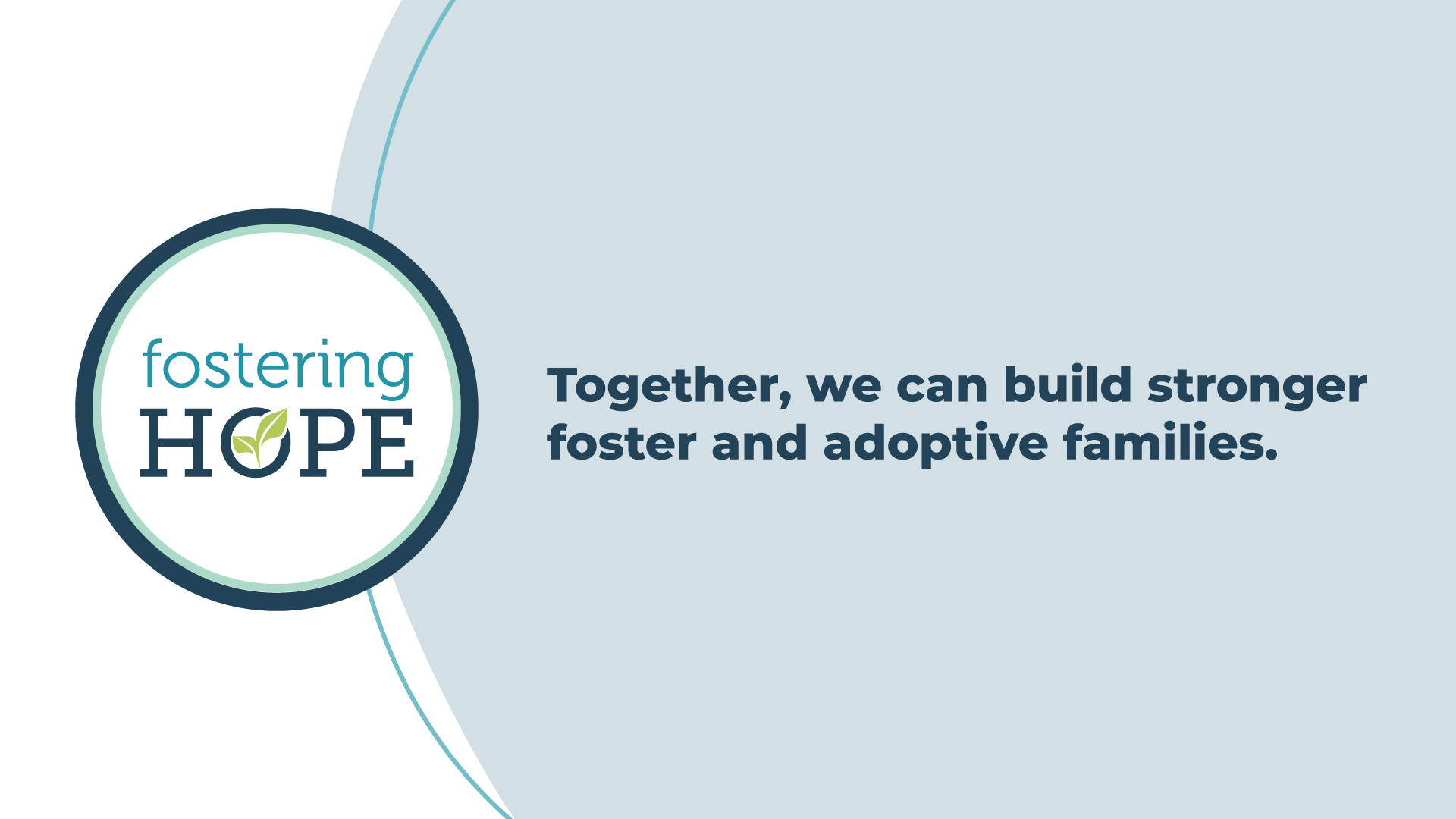
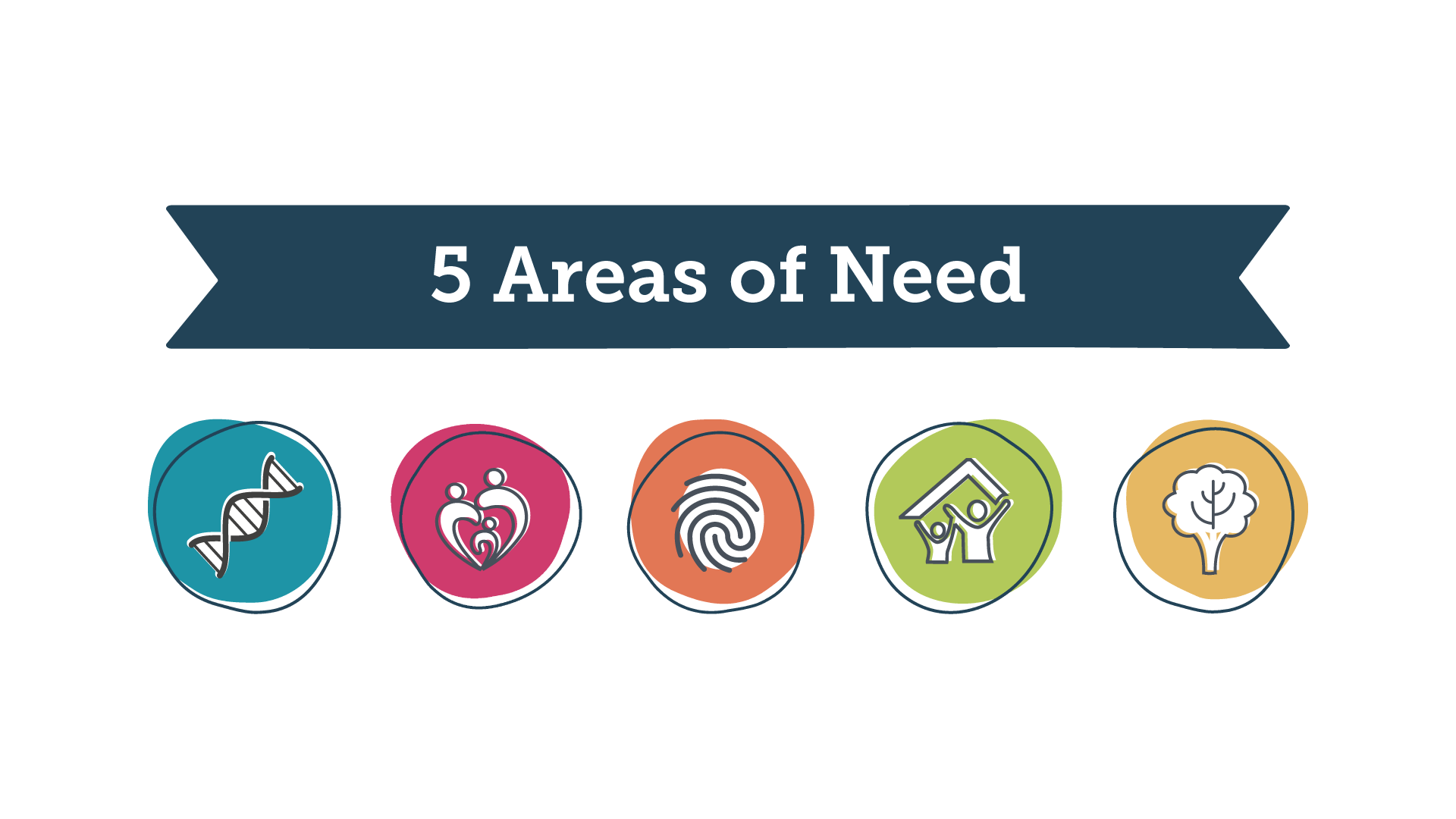
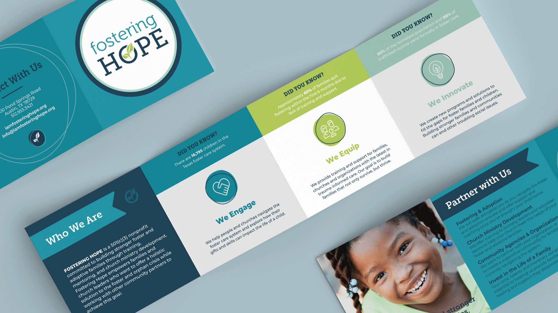
Fostering Hope desired a logo that felt fresh, hopeful and communicated the idea of cultivation and growth. We collaborated on the original logo years ago, and I recently had the opportunity to reinvigorate the brand with a fresh color palette, imagery and non-regional logo to coincide with their state-wide vision. I’ve used the idea of an “imperfect circle” throughout their visual language as a symbol of the family. No family is perfect, but they can be strong and whole. In our years-long partnership, I have designed brochures, signs, conference materials, training assets, board reports, PowerPoint presentations, t-shirts, Christmas cards and so much more!